About the Images
All images are printed with archival inks on Ilford papers. Images are printed to 12x18 or 20x30 inches.
Surgical Photography
As a Medical Photographer, I was often asked to photograph in the operating room. The images were used to accompany journal publications, illustrate teaching texts, or for medical/legal purposes. Always, the photographs were meant to document the procedure in process and as such they need to be accurate and true, faithful to the subject.
These photographs are not to those standards. Unmanipulated, they are a product of the photographic limitations of digital cameras. The overhead theater lights so over power the room lights, that proper exposure of the foreground forces the background black. The reality of the scene is of a room well lighted.
These images remind me in style and mood of a Caravaggio. He manipulated his lighting to sweep away extraneous detail, sharpening focus on the action, creating mood and capturing the attention of the observer. Applied to this subject, one is able to visualize the delicacy of motion and choreography of activity. Surgery is seen as much art as science.
It is ironic to me that these images are, in many ways, more accurate depictions of the surgical procedure than the proper documentary medical photograph.
Night
There is little light at night and as a result camera exposures are long; 1,2 10,20, or 30 seconds. I’ve photographed with the camera on a tripod, a monopod and handholding. I think the most successful photographs are the handheld ones. If you look closely enough at these, sometimes you can see my respirations and feel my pulse.
As dusk turns to night color fades from our vision. Our retina contains rods and cones. Cones are responsible for color vision. They must collect a lot of light for our perception to be in color. Rods are much more sensitive. They function under very low light levels, and they present a monochromatic image. As a result we loose the awareness of color at night. The camera, at night, does not suffer from this limitation.
Surface reflectance and the color composition of light determine our perception of color. During the day the quality of light has a fairly even mix of all of the colors of the spectrum (roy-g-bv) (red, orange, yellow, green, blue, violet). Only when objects are illuminated with light of this composition will our perceptions of color be normal. Cameras are designed to see color like our eyes, presented with a full color spectrum, color is recorded as expected.
Light at night tends to have limited color composition and the camera’s recording necessarily appears otherworldly. If we could perceive color at night, likely it would appear like this.
Winter Trees – Color Combines
James Welling‘s “Dance Project” was published in Aperture #221 – 2015. He produced color images by place three disparate b/w images in Photoshop’s RGB channels. I was not particularly enamored with his results but was intrigued with the process.
My riff on his work is entitled “Winter Trees - Color Combines”.
I photographed groups of leafless trees, a crown and two branches with a decided left or right orientation. Each was converted to b/w and a single color image was created by placing them individually into the CMY channels. I used a Black Channel (K) outlines to strengthen the color image. This option is unavailable using the RGB channel technique.
Each image is composed of a crown (centered), and 2 branches. I made three variations of the color photo by rotating their placement in the CMY channels. Each of the original b/w’s appearing, in succession, in one of the CMY channels. The three resulting color photographs were composited into a triptych, with the center photograph flipped L-R, creating continuity across the border of the images.
Using the same three photographs, I made another triptych with a different center image. The second triptych was flipped horizontally and the two combined. Notice the continuity/symmetry across all seven image borders.
I believe I’ve created a particularly handsome group of images, worthy of close inspection. But what I really like about these is the role chance plays in their creation & I believe Welling felt the same way. Quoting him from aperture 221, “I am continually surprised by the strange images I create using color channels”.
Owing to chance juxtaposition, colors flit between the secondary (CMY) & primary (RGB) in totally unexpected ways, creating a compelling lesson in color theory.
Chance again plays a role is the creation of mysterious objects across the symmetrical borders, these often more interesting than the original components.
Not sure I’ll take the idea any further but will say they were fun to make, really kind of a brain tease doing so & that made the project worthwhile.
River Rocks
Our friend Penny moved north & left us this basket of stones.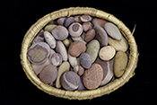 They just begged to be photographed. Long ago I heard Jim Hendersen speaking about photographing petroglyphs. He wet the rock and photographed them with cross polarization. I did the same.
Fast Food
fast food and pink meat
we are what we eat
foods of convenience and necessity
Food is more than just what we eat; it is life itself, family, tradition, birth, marriage, sickness, and death. I have been looking a lot at food lately and much of it looks like this
In science, truth and beauty are often equated. Although beauty is always in the eye of the beholder, clearly much of what we eat is not food.
Magnets
Berenice Abbott (1839-1991) is perhaps best known for her body of work documenting New York City, published as “Changing New York” in 1939. She is equally well known as Man Ray’s studio assistant & for her preservation of the photographs of Eugene Atget by bringing them to an American audience.
Less well known (but of interest to me as a medical/scientific photographer) is her documentation of scientific phenomena. Her interest in scientific photography started in 1939 & continued through the 1960’s. Her photographs illustrated physics textbooks of the 1950s and 1960s with elegant photographs of abstract scientific principles.
In 2012 her “greatest scientific hits” were brought together by Steidl and published as “Berenice Abbott Documenting Science”. I purchased a copy in 2014 and lived with the book for a while.
I found her magnetic field photographs of particular interest and in Jan 2016 I starting working on my own version magnetic field photographs. I purchased iron filings, neodymium bar magnets (more about these later on) and made electromagnets. Over the course of a year or so I made a number of interesting images but just couldn’t find my direction.
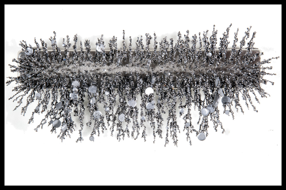
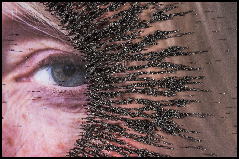
After a while I decided to put all away and come back to the project with fresh eyes at a later date.
At the end of November 2019, I noticed this on the studio shelf.The magnets as I had left them in 2016.
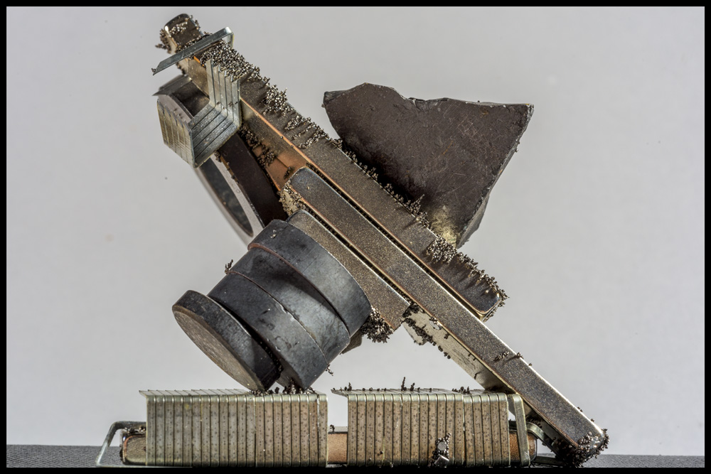
I was taken by the arrangement & realized that I should be photographing the magnets themselves rather than the fields they produce.
Back to the Neodymium Magnets. They came with the following warnings: “The greater forces exerted by rare-earth magnets create hazards …… Neodymium magnets are strong enough to cause injuries to body parts pinched between two magnets. Magnets that get too near each other can strike each other with enough force to chip and shatter”.
I can attest that these are not exaggerated warnings.
Often times after the initial setup of a still-life you realize that a slight shift of one of the objects would improve the composition. More often than not, movement of magnets would bring them in close enough proximity that their fields would attract & they would just snap together, collapsing the structure, frequently pinching my fingers and shattering to boot.
There are also steel tools as well as steel punch-outs and iron filings in the photographs. The tools were somewhat easily placed. Even though the were strongly seized by the magnets I could usually get them were the need to be. The filings and punch-outs were a different story. Being very light, as soon as they were near the magnets, the field would grab them, their final positioning left to chance. If they landed in a unacceptable position, trying to reposition frequently collapsed the structure.
Photography should be fun & making these certainly was. It was the unpredictable nature of their attraction that made working with the magnets so very interesting . I often felt as if I was skating on the edge of disaster with each setup in danger of imminent collapse. Impending failure in some way adding to the pleasure of creation.
Fair Fruit
As an educator, it is at times difficult to convince my students that interesting, compelling images may be made anywhere with almost any subject. That’s not the geneses of these images; however I think they prove the point.
Prize-winning fruits and vegetables. Judged to a standard which is incomprehensible to me yet never the less I am drawn to the mystery of their triumph. A discussion between two exhibitors on the relative merits of apparently (to me) identical jars of pepers is as fascinating as string theory.
I love the fair.
Wire
In a roundabout way
One of the things I like most about photography (or at least the way I practice it) is that I often come to new work in a roundabout way.
Awhile back I was interested in photographing magnetic fields. I planned to use bar and electromagnets. My friend Marshal gave me a considerable length of 25 pair/50 conductor phone cable to make the electromagnets. This type of wire dates, I think, from the 1970’s. Interestingly, each of the 50 wires is uniquely colored.
This project never came to fruition and its parts ended up on a studio shelf for about four years. Eventually I decided to photograph combinations of the bar magnets as sculpture. The phone wire was quite colorful and too cool not to use. I made small wire figures (with my son Weston) and planned to include these in the photographs.
For reasons I was unable to clearly articulate at the time, the wire figures just did not work with the sculptures and they ended backup on the studio shelf. I did finish the magnet series (sans figures) and that work may be found here http://www.willwillner.com/Will/Magnets/index.html.
The wire figures were/are quite nice & sat on the my studio shelves for about a year and a half. I pretty much saw them every day during this time. They shouted out to be photographed & I did July 23. Taken individually with limited focus a sense of scale is lost. A transformation takes place, they appear, to me, monumental. It becomes easy to anthropomorphize (perhaps zoomorphize is more appropriate) and wonder what they are about.
I received the wire in 2017, 6 years and 3 iterations later, it appeared in new work. In a roundabout way, I like that.
Fall Leaves
I Love the Fall – The air is crisp & cool, the sky a brilliant blue. There is nothing better than lying on my hammock and looking up and through a canopy of leaves. The transformation from lush greens to spectacular yellows, oranges and reds is a wonder to behold.
I Hate the Fall – An appropriately named season. We have 14 trees around the house; each having what seems to be countless leaves, all of which end up on the ground needing to be raked. It is an arduous chore and changes my seasonal joy to dread. Raking takes several weeks, I curse the trees and their leaves. This year I decided to photograph them as they fell to remind me of delight they in fact do bring.
Vortographic Self-Portriat
Alvin Langdon Coburn photographed in the early 20th century, although American born he spent most of his creative life in England. He successfully transitioned from pictorialism to modernism. By 1907 at age 24 he was (by some) considered the greatest photographer in the world. His interested were many and varied. Among his intellectual journeys were; post symbolist music, comparative religious studies, astrological portraiture, Fenollosa and Eastern Thought, Japonisme, The Universal Order and the Shrine of Wisdom, Taoism, Freemasonry and the Linked Ring, Awen and the Druidic Principle of Unity, Gnostic Philosophy.
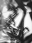 Along the way he made a brief stop (a month or two) at Vorticism (a British artistic movement influenced by cubism and futurism) and produced a series of eighteen kaleidoscopic photographs. He titled these as vortographs.
In homage to Coburn, I produced the eighteen images in this series, ‘Vortographic Self-Portraits”. The repetitive pattern is created by a re-photographed self-portrait containing an image of the object that is also in the center of kaleidoscope.
Evidence
A well-honed portrait could be viewed as evidence.
Images from this series are of SX70 polaroid portraits. They are autobiographical and forensic in nature. Identity is elusive.
evidence of life allowed
evidence of life lived
evidence of life
Tilt ~ Half Life-Size ~ Green
One of my favorite photographers, Minor White, wrote
“….It is like writing verse in some strict form, the sonnet, for instance, whose rules are enslaving till they become second nature. Then by some miracle of adjustment the manacles themselves become the wings of expression.”
Although he was not specifically writing about photography at the time, I’ve often used this thought, giving myself “strict form” or more precisely exacting restrictions for an image series, hoping the limitations will allow me to spread “wings of expression”. The photographs in the series Tilt, Half Life-Size & Green were made in this manner.
Tilt
Constraints - 80mm tilt/shit lens @f/2.8 - Left & Right Tilts On Monopod 24 inches from subject
I like this quote, “Focus helps distill subject from content”. The amount of focus in an image (depth of field) is easily controlled; f/stop, focal length & camera to subject distance all play a defined roll in controlling depth of field. It easily possible to have the entire image in focus or just a tiny slice focused. Depth of Field influences image rendering and changes the meaning and intention of an image
I like this quote also, “An image composed of subject and everything else”. Frequently, it is the appearance of the everything else that separates the good from the excellent. Often the everything else is found in the out-of-focus stuff.
Lenses are designed to have their optics parallel to the camera’s imaging device and as a result depth of field (the plane of image focus) is also parallel to the device. Tilt/Shift lens allow for the lens optics to be moved at an angle to the capture device.
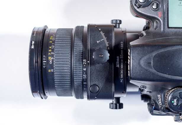
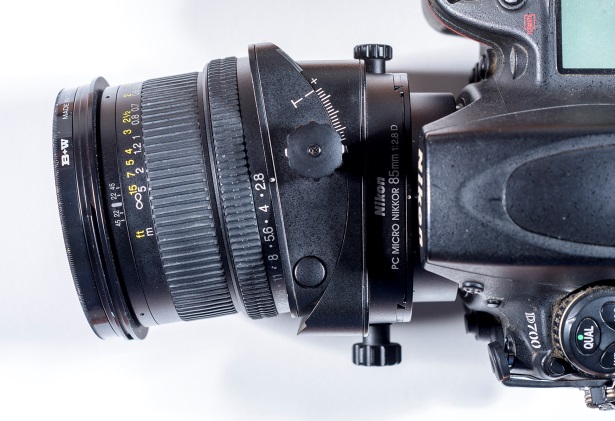
I’ve tilted the lens both left & right. This results in a change in the image crop as well as the placement of depth of field. The images read almost like the l.r. views of a stereo photograph; similar but subtly different. The subject (focused object) is the same in both; it’s the everything else that acquires significance. These really need to be seen at size ~24x16” in order to appreciate the differences between the images.
My intended subject of these image pairs is really the alteration of the photograph caused by the lens tilt. To my eye the differences in the distribution of the depth of field is most significant. These differences make for quite different images.
The objects are really just place holders making the image comparisons easier, but they intrigued me leading, somewhat later, to the next series – half-life size
Half Life-Size
Constraints - 60mm macro lens focus set manually to ½ life size - subjects @ 10 inches
I own and regularly use 7 different macro lenses. They allow you to get very close to the subject and photograph at higher than normal magnifications. These lenses are optically designed to photograph at least life size. Looking and framing are major photographic concerns. Close focus work concentrates both. Slight movements of the camera dramatically changes composition. Macro lenses require a hyper-awareness of vision & that appeals to me. They allow for discovery of extraordinary beauty in things or scenes that were not designed with an aesthetic in mind.
These objects, found while walking my neighborhood, were all photographed at ½ life size; each was exactly 10 inches from the camera.
Magnification is easily understood photographing with film. The image of an object photographed at life size (technically 1:1) will be the same size as the object itself. Photograph a dime with film and place the dime on the negative & they’ll be the same size. Image-object comparisons are easily made.
The concept of magnification digitally is a little trickier to come to. Open an image in photoshop & choose image size. Then refer to the pixel dimensions (top arrow) and copy the smaller of the 2 numbers into the resolution box, insuring that the box resample is UNCHECKED (bottom arrow). Send the resulting image to a printer and you’ll be able to make the image-object comparison necessary to calculate magnification. 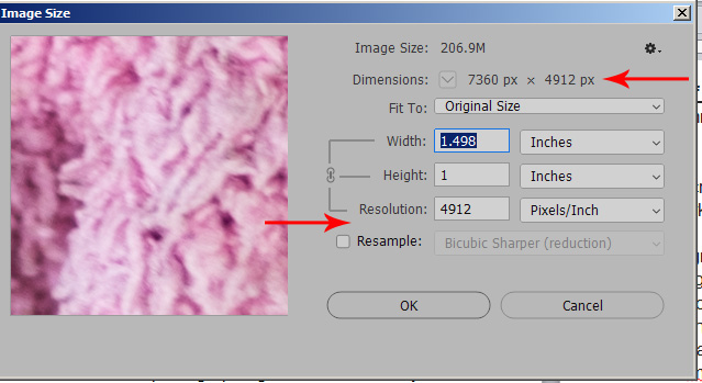
Green Leaves
Constraints - 55mm nikkor @ f/1.2 with +4 diopter - Trans-Illuminated Leaves.
The subjects are green leaves, each with light coming from behind and thru. But the photographs are really about bokeh.
Bokeh is a Japanese term concerning the aesthetic quality of the blur produced in the out-of-focus parts of an image produced by a lens. Bokeh is not how far something is out-of-focus, but is the character of whatever blur is there.
These photographs were made with a rather old and fast lens (a 55mm f/1.2 nikkor dating to the late 1960’s). As differences in lens aberrations and aperture shape & size are primarily responsible for the appearance of the “quality” of the bokeh, the age of this lens’s timeworn design characteristics seem to make it an idea choice for an exploration of bokeh, particularly when photographing wide open (@ F/1.2). I also used an inexpensive +4 diopter lens to allow for tighter images and to accentuate the lens’s foibles.
Mothra vs Godzilla
My son Talor built a beautiful balsa wood frame house in a high school architecture class. We kept it around our home for a long while. Eventually, he decided to set it alight. I photographed the burning and was quite taken with the images.

For years afterward I envision an image series entitled “Burning Bechers”. (Check out the Becher's book Frame
Houses) The series just never came to pass.
Awhile back I was in harbor freight and discovered dye-cut wooden model kits of dinosaurs and insects. Easily assembled, relatively detailed and very flammable. I returned to a misspent childhood of watching too much Japanese Sci-Fi; Mothra vs Godzilla. These photographs are from these influences.
If there is a pyromania gene, it runs in my family.
Fowl
In striving to make meaningful images often times we lose sight of the fact that at its most fundamental, photography is a visual means of expression. These are just pictures of fowl. Pretty ones indeed. Visual confection, satiating but not symbolic....Some times this is enough.
Ribs 4 Ways
The family had been eating ribs –
I was looking at dieter applet’s photography & this image caught my eye. I asked my son Weston to model a sculpture after applet’s image.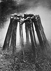
Series 1 – My intention was to photograph the bones over the course of a year – the bones were on a table outdoors. I photographed different times of day & moved the table to capture changes in the direction & quality of the light. I used every lens I had. Eventually the sculpture collapsed.
Series 2 – I wasn’t quite finished and asked Weston to build another piece –his next effort wasn’t what I expected. I photographed outside – but the images just weren’t working. I realized I would need to change my direction and worry less about continuing the series and think about starting anew. I brought the piece into the studio and photographed with a single lens and focus stacked. The photographs really need to be seen enlarged, the detail is quite stunning.
Series 3 – Yet another set of ribs. Thought I would work outside again & filled a large saucer with sand. This time I planned to reposition the bones after each photographic session. I neglected to account for drainage. The saucer filled with water after each rain. The bones began to dissolve. Again not what I had in mind. I brought the ribs into the studio, photographing with strobes & as a foil to series 2, I photographed with a shift lens – causing limited and interesting changes in focus. And as planned, I repositioned the bones regularly.
Series 4 –Edward Weston (my favorite photographer) made a truly outstanding image of seaweed under a sheet of glass. As homage, I added glass to the dissolving outdoor bones.
Very un-intentionally the color pallet of these images matches those of the first. The circle squared and series complete.
I worked for 20 months and shot 1500 images. Although there were many interesting images, these were chosen because they seemed to maintain a narrative thread.
Lobsters & Roaches
We used to have Lobster races the evening before Thanksgiving. The loser would go into the pot first. Our friend Jane insisted that Lobsters and Roaches were related. She never participated
911
After 9/11 almost everyone I know who makes art, made art. My son Talor and I made the images of police and firemen at that time. I’ve continued through the wars in Afghanistan and Iraq with images of solders.
Clinton
In the early 90’s I recorded the broadcast news on vhs tape, frequently but not regularly. At the time I had a Targa frame grabber which allowed me to digitize single image frames from the tape. The process was quite tedious. Off a fraction of a second with a mouse click and the wrong portion of the tape was captured. This was pre PC Photoshop. RIO, TIPS & QFX were the software available, all now gone.
I searched the tapes for images of Clinton. I hadn’t any pre-conceived ideas about what I was looking for just Clinton and whatever he was on camera speaking about.
What interests me most about these photographs NOW is how little has changed. We are still discussing the Military & LGBTQ, Education, Immigration, Iraq, Healthcare, North Korea, Special Prosecutors, Human Rights ………
Morandi Homage
I had been working of series on images, which were explorations of photographic representation, and had been wondering about the minimum amount of information necessary for a readable image when I became acquainted with the paintings of Giorgio Morandi.
About Morandi: from "Giorgio Morandi" by Karen Wilkin
...a tug of war - between the specific and the elemental lies at the heart of Morandi's work. He seems to explore how much he can simplify before the objects … become unrecognizable.
…It often seems as though he were testing the limits of representation…
…objects seem to be on the brink of dissolving without ever quite relinquishing their recognizably solid origins.
…apparently identical groupings of objects, altered by the addition or subtraction of a single element,..., can serve to completely shift the dynamic weight and the spatial logic of a given composition…
…Taken one by one, the paintings are close studies in rhythm and balance…seen in series, intricate rhyme schemes surface as objects change shape, placement and chromatic tone…
Morandi’s paintings seem a perfect point of departure for this body of work. I photographed still life’s in homage to Morandi. Although I am quite comfortable esthetically with digital image manipulation, these images are not of that ilk. Full resolution photographs are re-sized to 36 pixels wide and printed with an inkjet on transparency material. These small (3.6mm wide) prints are re-photographed microscopically and re-printed to 24 in x15 in. The dots on the enlarged photographs are actually drops of ink. I am beginning to understand the translation from large to small and back again to large and its affect on the limits of representation. I still have much to learn about Morandi’s approach to spatial logic.
Restrooms in Public Spaces
I played chess at the Taggart’s every tuesday night for two years. While it was Tony’s move, Bonny spoke to me of art. Rauchenberg and Johns, Klee and Kline, the usual bunch. She believed that Duchamp anticipated all of 20th century Art. Rrose Selvay & R. Mutt’s Fountain. At the same time I was reading the Daybooks and discovered Weston’s Excusado.
These images are the most recent exploration of those influences.